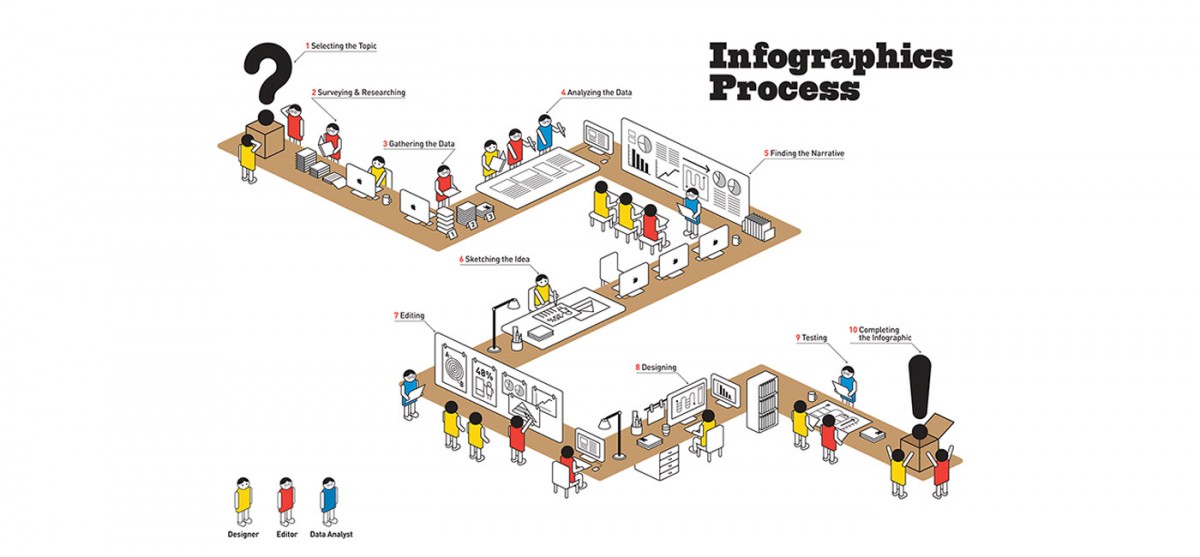
Information is very powerful.
But sometimes information can be presented in a bland and unimaginative way. This is where good infographics come into play. Infographics translate information in a visually pleasing and instantly understandable manner. Once used predominantly to make maps more approachable and scientific charts less daunting, infographics have now permeated all aspects of our modern digital world.
Sometimes information can appear daunting, with the sheer amount of data being presented. But a well designed infographic becomes a clear and accessible vehicle for imparting knowledge to an audience.
There are different levels of thought and design in every infographic and below we talk about the basics for a strong infographic design:
5 Essential Steps To A Good Infographic
1. Skeleton & Flowcharts
Approach an infographic as you would, any other form of design. Put together a skeleton of words and arrows, grouping relevant data together and visualising the flow of information using flowcharts. Because infographics are usually complex, flowcharts will simplify the process and connect everything precisely for you.
2. Devising A Color Scheme
A color scheme is very important to convey a wide array of messages while keeping the reader confined inside the infographic. With huge and complex infographics, readers will become quickly confused and their perceptions will be scattered all over the place if they don’t have colors tying down their thoughts visually. You can have 2, 3 or 10 colors but assigning them before you begin designing will be the most important thing you do.
3. Graphics
There are two kinds of graphics in an infographic. They are theme graphics and reference graphics.
- A Theme graphic is the defining visual of the design and is usually always central in the infographic, except when the infographic is more statistic based. Choosing the right theme graphic will tell you reader at a glance what knowledge you wish to share.
- Reference graphics are usually icons used as visual pointers to avoid cluttering up the design when a lot of content needs to be represented. They are brilliantly capable of making numerous references using the same instance. Sometimes words aren’t even necessary if powerful reference icons are used, a practice more and more designers are using in a bid to make their infographics as word-free as possible.
4. Research And Data
It goes without saying that all infographics must be thoroughly researched and the data presented must be backed up by established facts. While doing that, you will inevitably end up with piles of data. Sifting through that, you must condense and decide what data is the most relevant and how you are going to present it. The ratio of data to the graphics works best if it is 1:1.
Another important point to remember is demographics. Know your audience.
Who is going to be using your infographic? Are they regular office going people who are used to sifting through a lot of written information or tourists from a non-English speaking country? Depending on the demographics, your infographics should accordingly reflect colors, icons, knowledge and complexity.
5. Knowledge
Highlighting important content to easily provoke deductions is an art. As mentioned before, knowledge is powerful and the imparting of that knowledge must be powerful too.
If your infographic is concentric, having the most important content both visual and factual in the middle is a plus. If your infographic is horizontal, the extreme left and extreme right are the starting and ending points of a reader’s deductions and thoughts, so having your say in those spots will be extremely beneficial. Choosing the right colours and imagery is vital.
In the end, an infographic can be as simple and as complicated as you want it to be. A good infographic will not confuse you but will be clear and easily understood. Put yourself in the shoes of the people who are going to be using your infographics and you’ll design a great one!
Special thanks to Sneh Roy, Sydney, Australia for excerpts from her article.
To see some of our favourite infographics – look at our Pinterest Board http://pinterest.com/unahealydesign/favourite-infographics/
Click here for our own infographic samples
If you are good on compiling the content and information side of your infographic but you need a little help with the visuals – call us for a chat on 086 3963316 or email us and see how we can help you create your perfect infographic.

