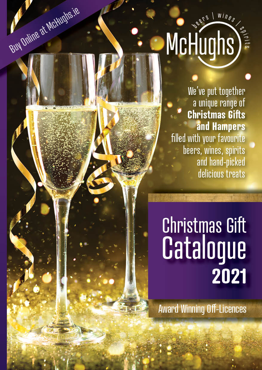
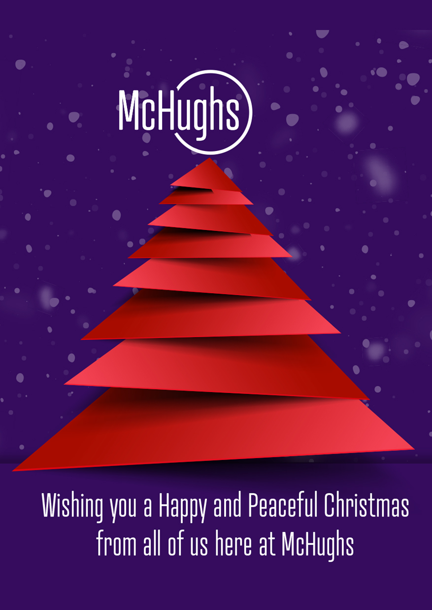
McHughs Online
Off Licence Business
The Brief
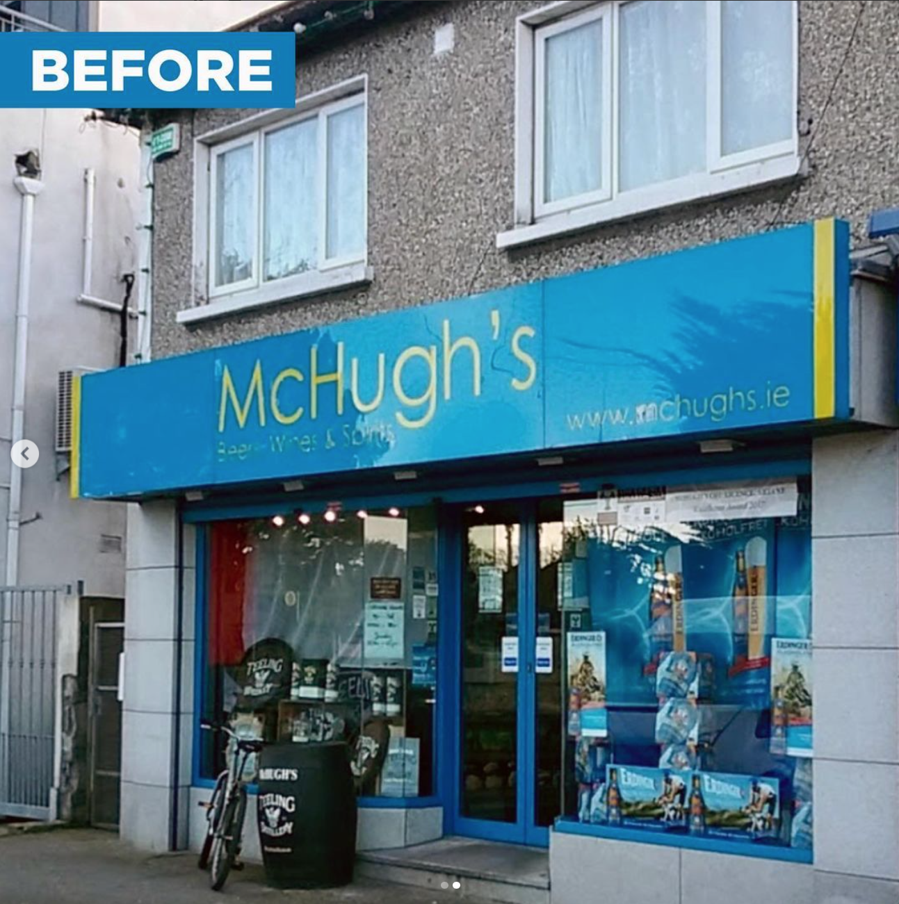
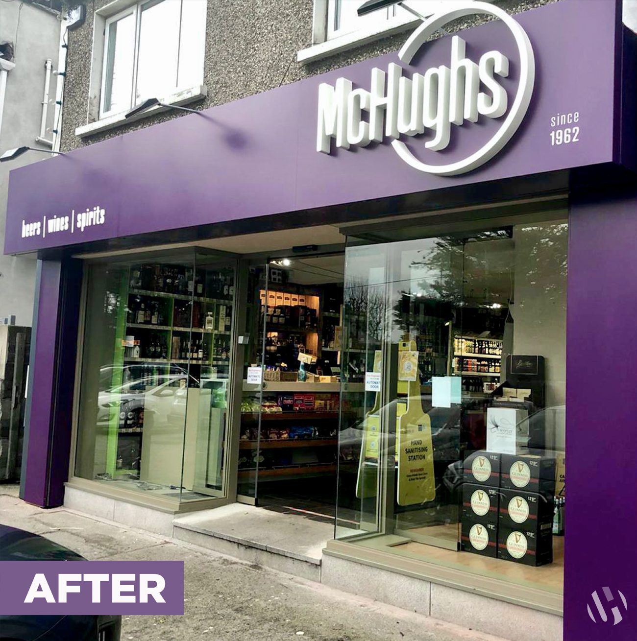
McHughs Off Licence needed a full rebrand to modernise their brand and visually represent the high quality of the service they offer.
The logo design uses a circular shape to portray a bottle/can/glass - all the vessels that are linked to products from the McHughs off-licence.
It also represents the mark left by a used glass on a surface after a satisfying drink.
The circle is the symbol of completeness with McHughs at the very centre of this. The typeface used here is modern, elegant and timeless with a strong, clean structure.
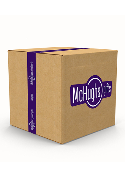
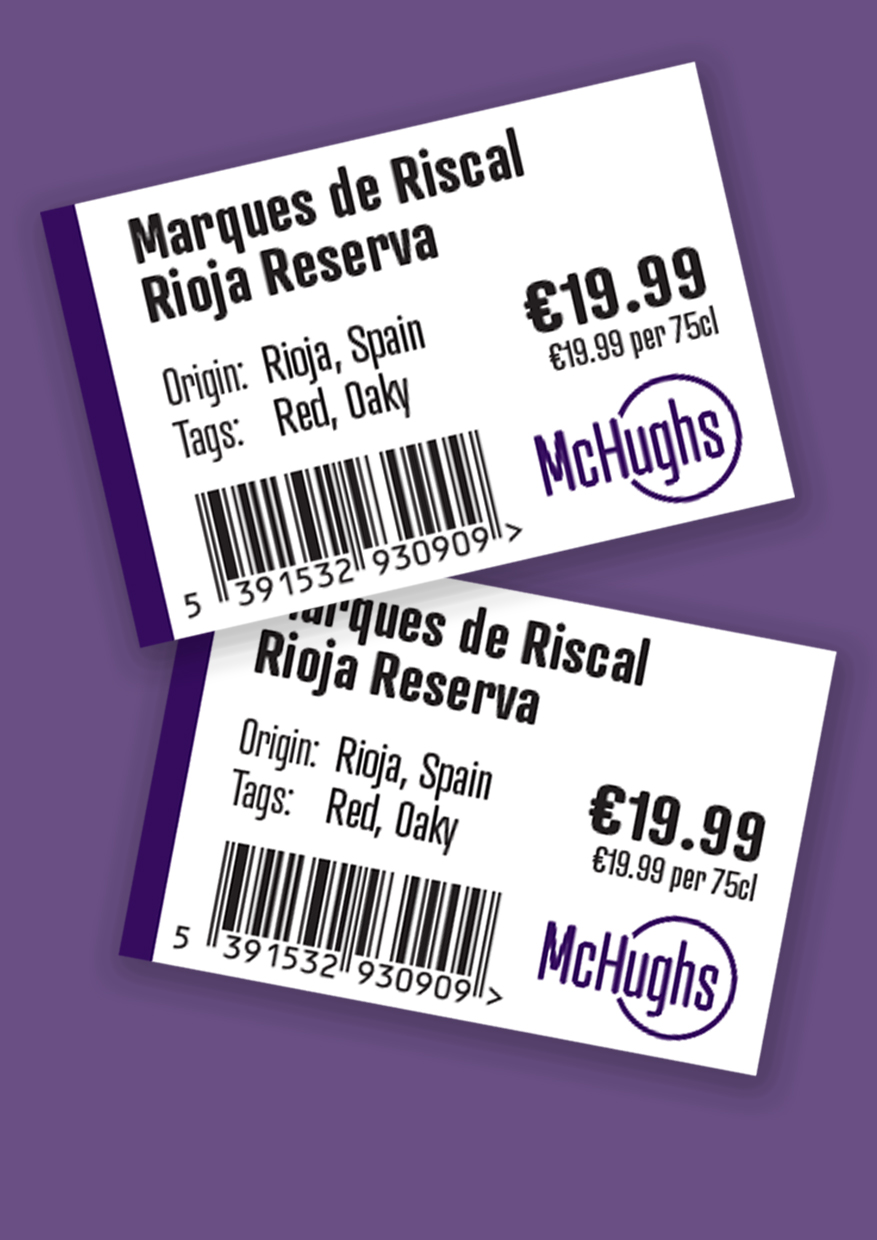
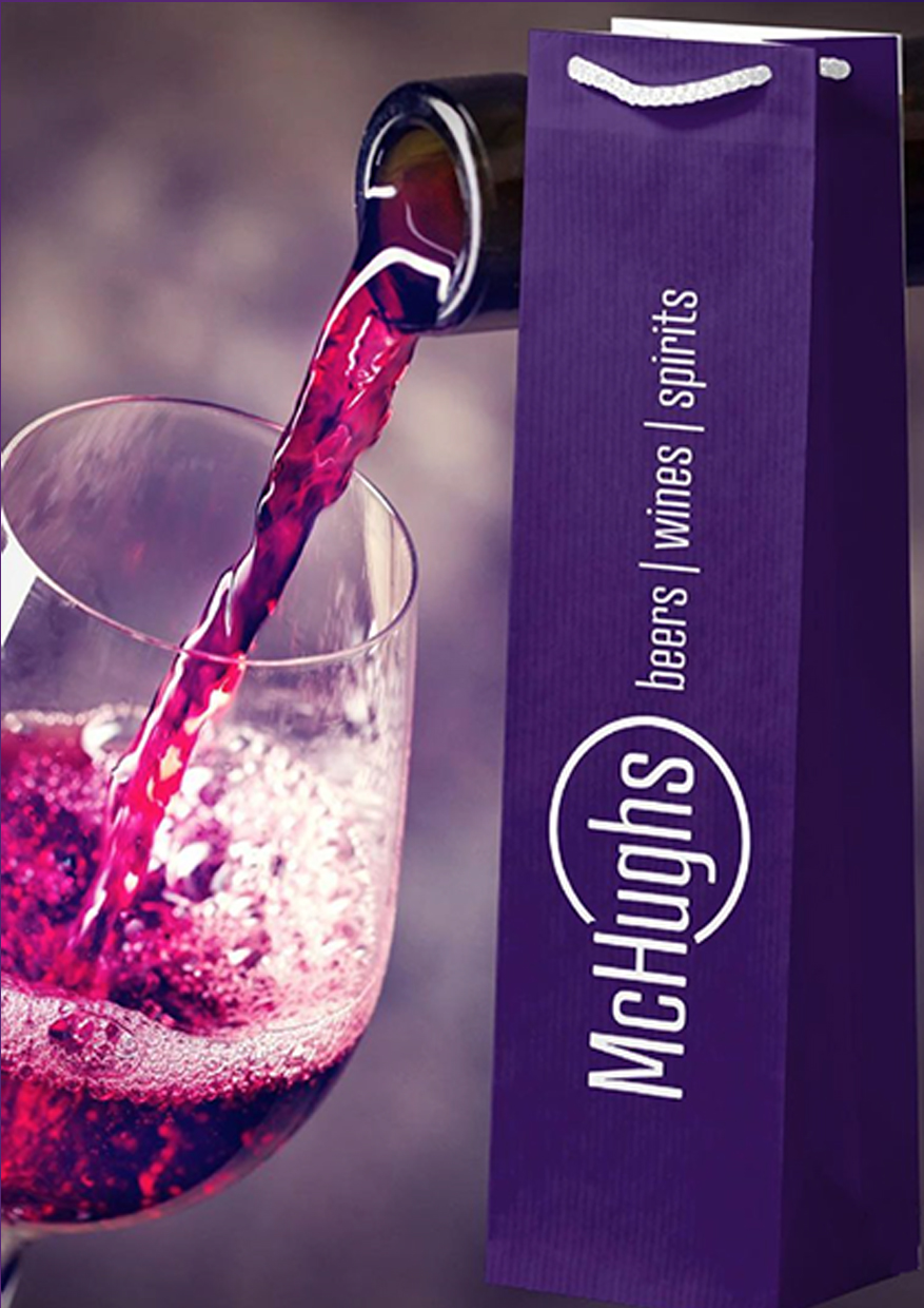
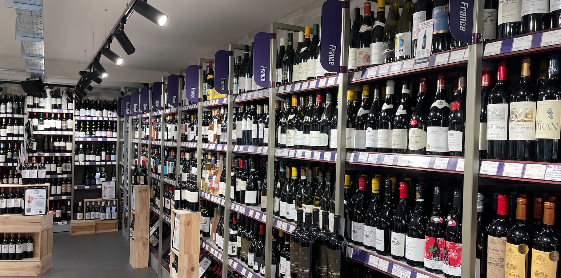
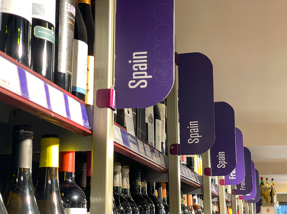
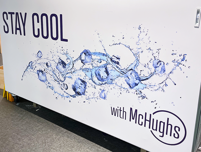
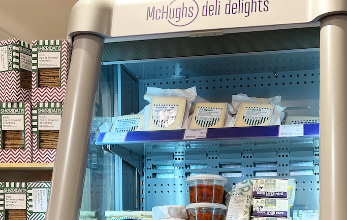
Brand Asset Design
Cohesive branding is essential. So everything from brochures, posters, wayfinding signage, price tags, packaging, social media messaging and uniforms were assessed and a design created for each item.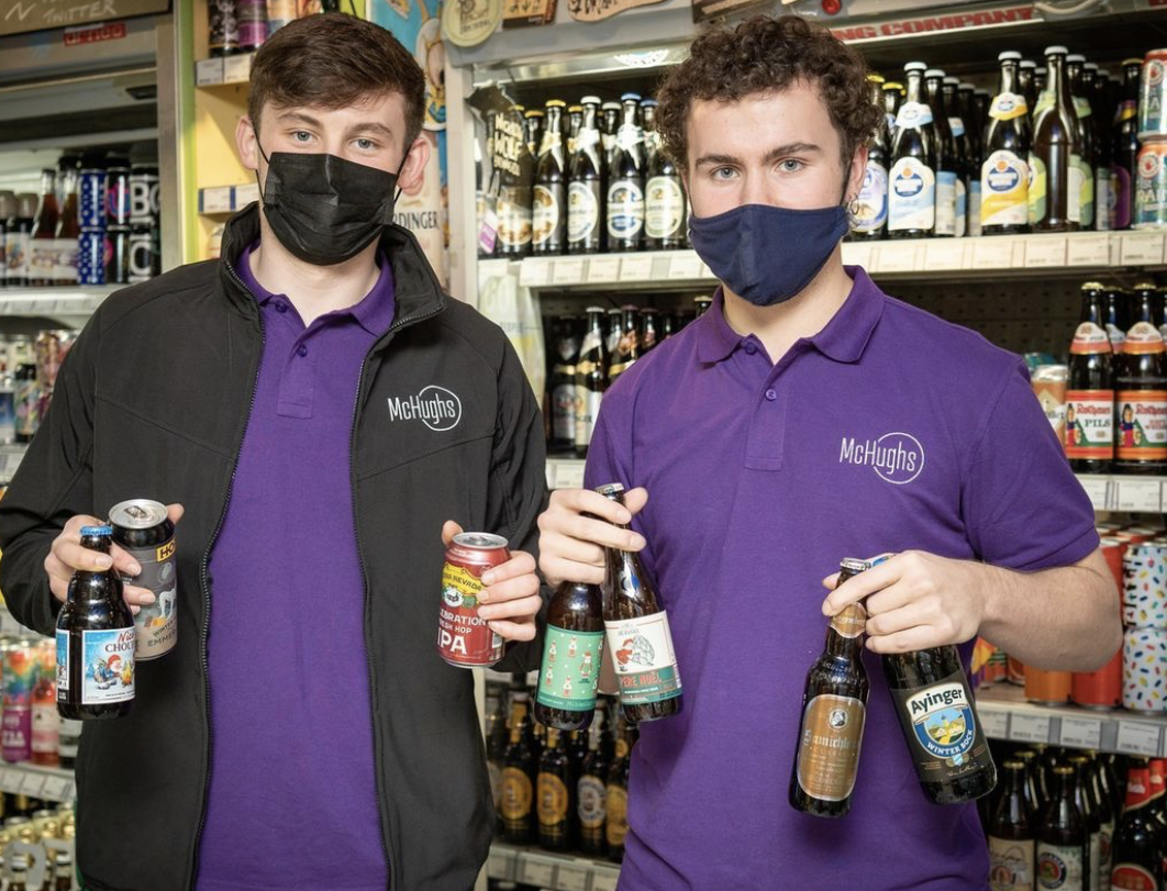
Website and Interactive Design
A large part of the McHugh revenue is generated online. It is important that all brochures are interactive and that they directly link back to the website. Brochures are sent out via email. Each image in the brochure is clickable and brings the consumer directly to that product page and its shopping basket. Easy shopping!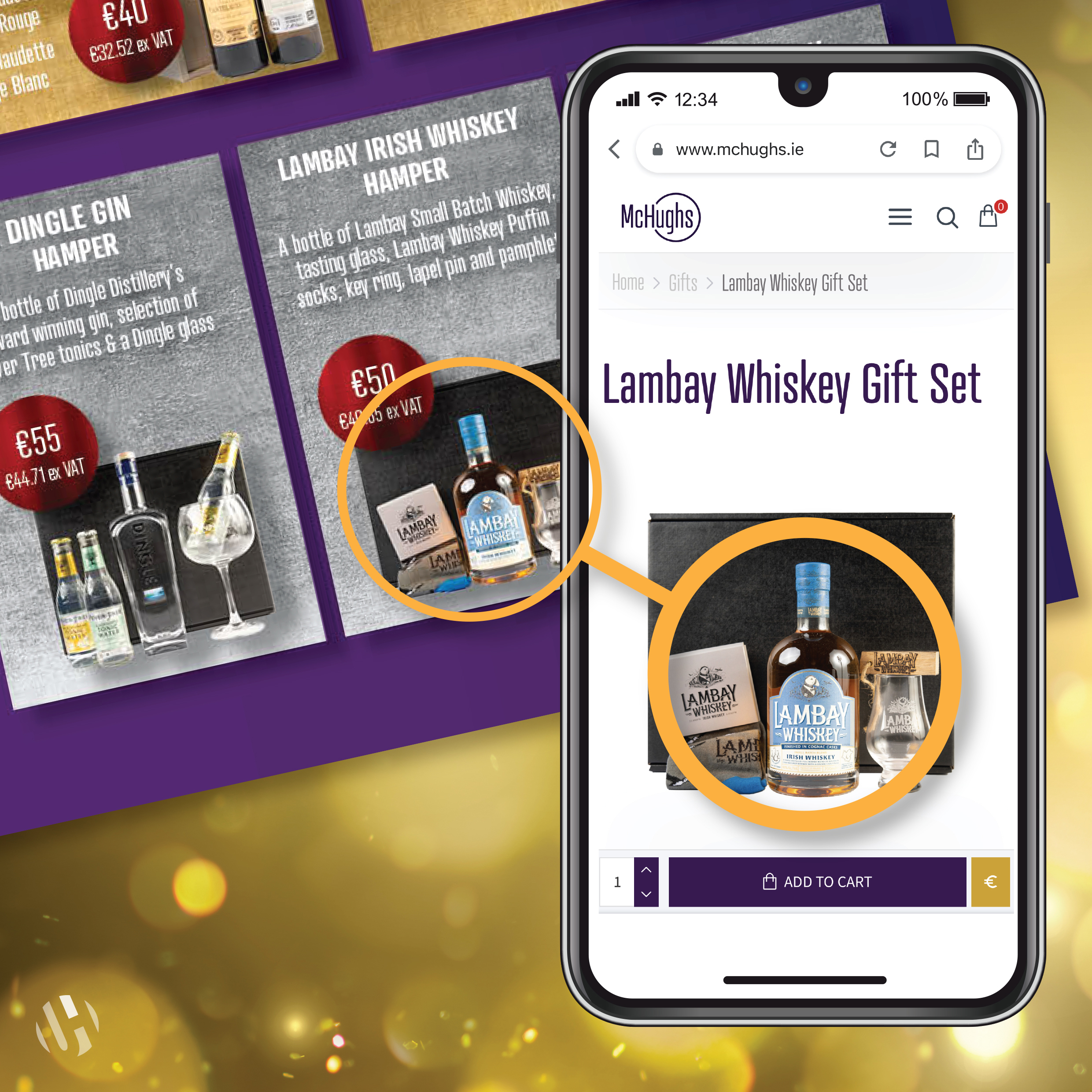
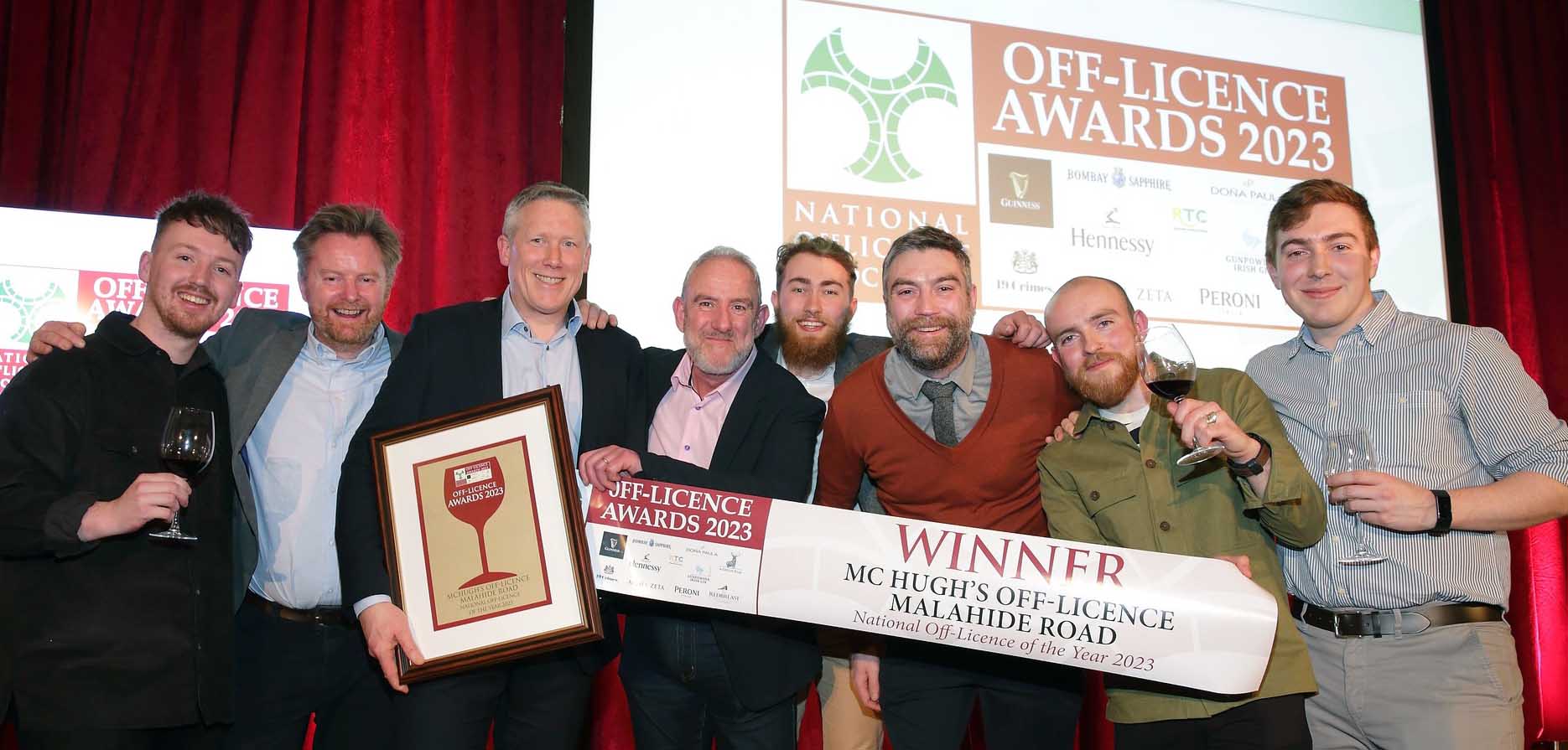
And huge congrats to the McHughs Team on winning the prestigious NOffLA Off Licence of the Year Awards 2023