
I came across this interesting infographic today. It shows how colour can affect consumer choice. It is designed by Kissmetrics and geared towards a North American market but can equally be applied to an Irish market. It shows that a staggering 93% of consumers put appearance ahead of other factors when shopping and 85% put colour as their primary choice of reason for purchase.
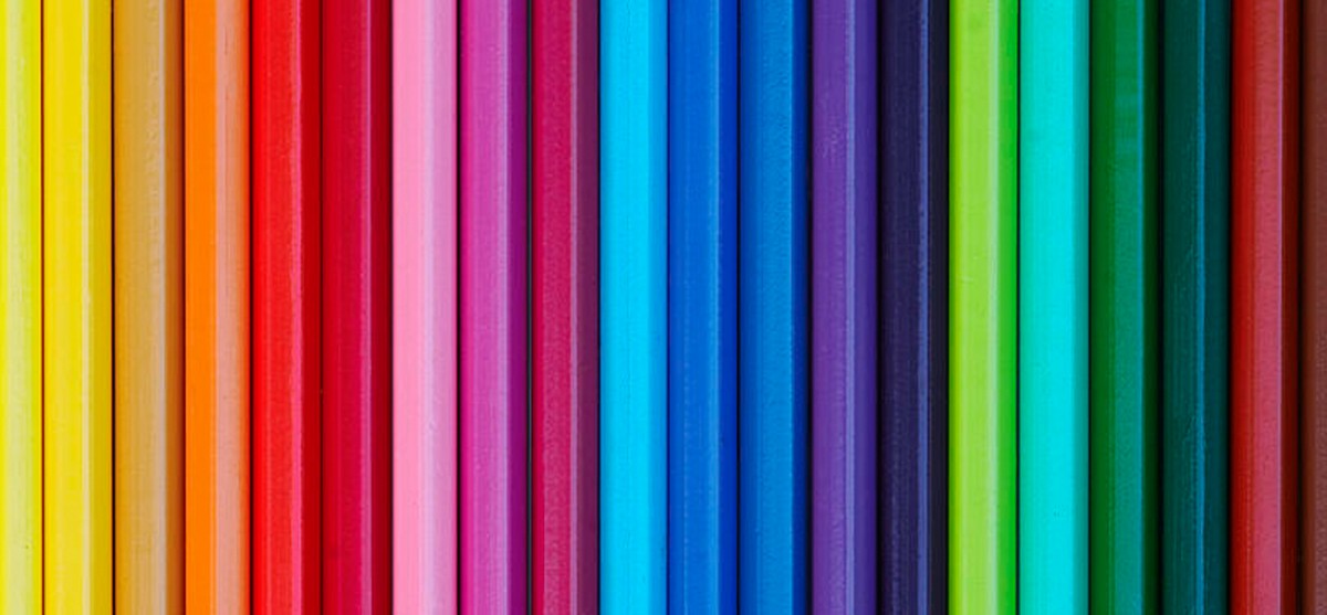
When choosing colours for a business product or brand – many factors need to be taken into account. Is the product fun or serious? Is the potential consumer young or old? Is the product or service you are selling a prestige product or perhaps something that needs to appeal to a mass market? When initially thinking of a colour scheme for your logo and branding, try and think about your potential customers and how you can appeal to them, rather than picking your personal preference when it comes to colour. Your colour schemes should be eye catching but harmonious.
Colour harmony engages the viewer and creates an inner sense of order and a balance in the visual experience. When your branding is not harmonious, it’s either boring or chaotic. At one extreme, is a visual experience that is so bland that the viewer does not engage with it. At the other extreme is a visual experience that is so overdone, so chaotic that it is difficult for the viewer to engage with that image. The human brain rejects what it visually cannot organise or understand.
The visual task of designing a brand logo requires that a logical structure is presented to the viewer. Colour harmony delivers visual interest and this sense of order.
Talk to us before deciding on your brand’s colour schemes. We can help you to choose a colour scheme that is attractive and engaging – and will, with the benefit of applying colour psychology, appeal to your potential consumers. We are more than happy to advise.
To follow our Colour Psychology Board on Pinterest please click below:
![]()

Click on Infographic to enlarge