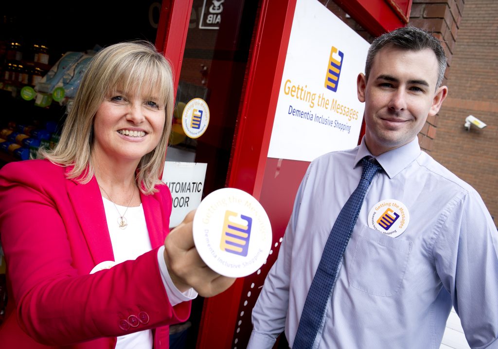
 We are thrilled to say that our work on Getting the Messages – Dementia Inclusive shopping has won the Universal Design category of the IDI Awards 2018. This project is one that is very close to our hearts.
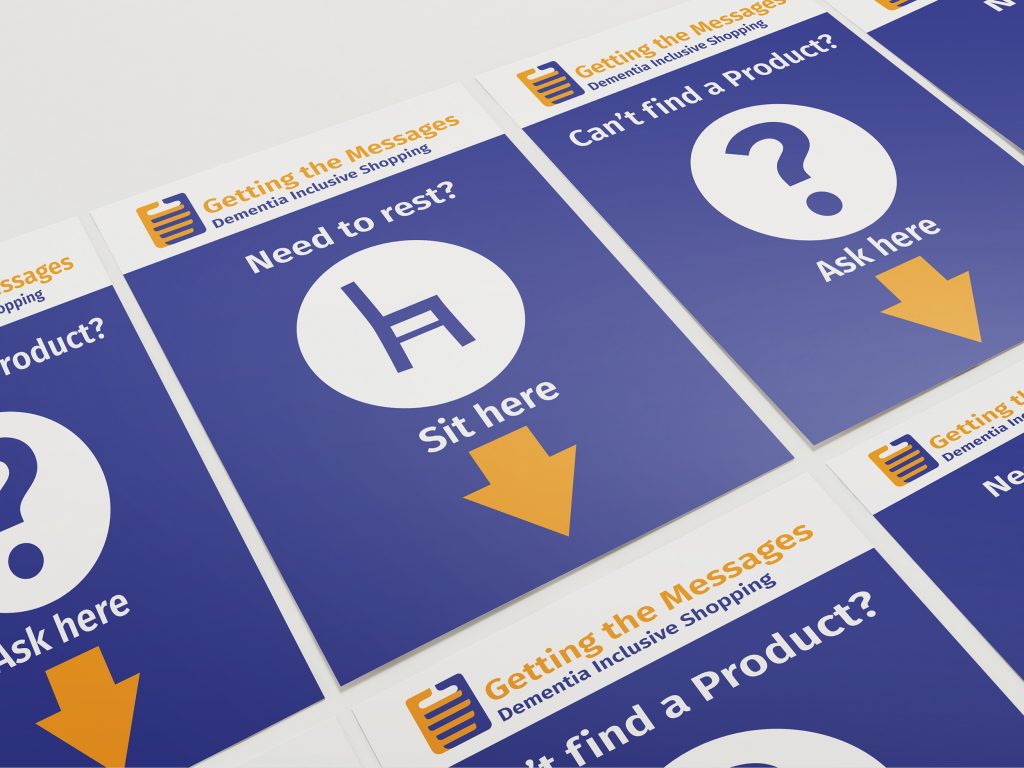
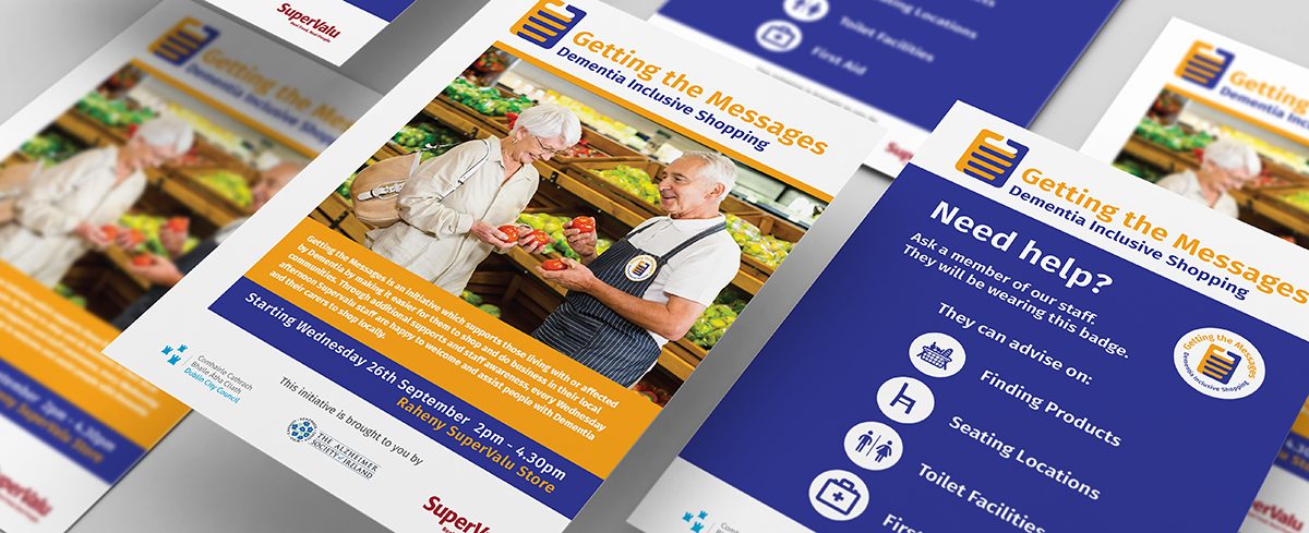
This Dublin City Council initiative (in partnership with The Alzheimer Society of Ireland and SuperValu Ireland) was designed to support those living with dementia and their carers, by making it easier for them to shop and do business in their local communities. It involved supports such as signage, appropriate displays and a seating area to create a more inclusive and dementia friendly environment. Staff training was also to be supplied with visual supports. The logo was required to work across all of the support material.
A full branding was required which included the naming of the project. The tone of the project was to be reminiscent of times gone by, to speak to the elderly person with dementia but also to the wider community. The style of lettering used had to comply to NALA standards. The colours and contrast were to adhere to guidelines supplied by The Alzheimer Society Of Ireland.
We were required to come up with a distinctive concept that was very different from logos already out there, that are associated with other dementia organisations and events.
The Resolution of the Design Brief
The Name: Getting the Messages. Recalling days gone by, when going to the shops was referred to as ‘going to get the messages’, we wanted to spark off an evocative memory in the mind of the person with dementia. The phrase Getting the Messages also speaks to the general public who need to ‘get the message’ about how prevalent dementia is becoming in our society, how we need to accept that dementia sufferers are becoming more commonplace and we need to be a more inclusive society. This brand name was tested out on members of the ‘Forget-Me-Not’ dementia inclusive choir. It struck a chord with the elderly dementia sufferers and brought back nostalgic memories to many of them.
The Logo Design: The logo design is based on two premises. Firstly, there are the two connected hands with intertwined fingers. These fingers form a weave reminiscent of the weave of a shopping basket. One hand portrays that of the person with dementia and the other, the hand of the wider community. They join together in creating a unified, assisted, supported and safe shopping experience for the person with dementia.
The colours are opposites on the colour wheel and this creates the highest possible contrast which is suitable for people with dementia. The font, while it has the strength of a sans serif font, it also has the legibility of a serif typeface. This creates a softer and more informal feel to the word styling. In accordance with NALA guidelines, the wording uses upper and lower case for ease of reading.
The logo needed to be both visual and literal for the various types of dementia learning. The icon of the hands forming the shopping basket is for the visual learner. The ‘Getting the Messages’ is the evocative and emotive line -for the linguistic / verbal learner. The tag line Dementia Inclusive Shopping is descriptive for the verbal / linguistic learner.


